We use various things everyday to get by, from toothbrushes to smartphones to microwaves. Usability is about making these things that we surround ourselves with easy to use, reducing the amount of thinking we have to do and thus the opportunity for making mistakes. Usability design principles can be applied during the design of all kinds of things, digital and analog. Bad usability design can lead to dangerous, sometimes fatal, mistakes. Below I’ve described a few examples of some funny, fatal and all-time bad usability designs.
Palm Beach election and the butterfly ballot
Who would have known that bad usability design could throw an election? Well, some people believe that is just what happened at Palm Beach election in Florida during the 2000 presidential election. Buchanan received an unusual amount of votes inconsistent with Palm Beach County’s liberal leanings and its large Jewish population. What happened?
Below is an image of the butterfly ballot that voters used to vote for their candidate.
This is what many believe happened at the day of voting: Seeing that Al Gore was second on the list, they punched hole number two to cast their vote on Al Gore. Only problem was, that they then mistakenly cast their vote on Buchanan, because the little arrow points from Buchanan to hole number two.
So are possibly thousands of voters plain morons or is bad usability design to blame for this incident? I would argue that the spatial, natural mapping between hole number two and the text “Al Gore” is stronger than the cultural convention (the arrow) pointing from the text “Buchanan” to the hole, especially when you take into consideration that people read websites, flyers and ballots not in their entirety but parts of them to find specific information to complete a goal. The voters found what they were looking for, “Al Gore” and cast their vote, possibly never reading the right side of the ballot. For more information on mappings and conventions in design I really recommend reading Donald Normans book, The Design of Everyday Things. It’s a must read for people interested in usability design.
Airplane crash
Bad usability design can have fatal consequences, as was the case on January 20, 1992, when Air Inter Flight 148 crashed into the Vosges Mountains while approaching Strasbourg Airport in Strasbourg, France. Sadly, 87 of the 96 crew and passengers on board were killed.
This accident has been ascribed to a confusing visual design of a digital display in the cockpit. Upon descending the airplane could be in two modes: Vertical Speed (VS) mode and Flight Path Angle (FPA) mode. The VS mode was shown in the digital display as two digits, whereas the FPA mode was shown as two digits separated by a decimal point. The pilot intended to put the airplane in 3.3 FPA mode, meaning it would descend at an angle of 3.3 degrees. Instead he accidentally put the airplane in 33 VS mode, which made it descend much faster at 3.300 feet per minute leading to the tragic accident.

Flight Path Agnle (FPA) mode.
What this lesson tells us about usability and user interface design is that modes are bad and should be avoided. If they cannot be avoided, it should be easily identifiable to the user what mode he is currently in to avoid mistakes. This was clearly not the case in the above example, where the only visual difference was a decimal point. Modes are often necessary in software programs, where the same actions have different meanings depending on the mode. One such example is a drawing program, like Adobe Illustrator, where different tools (modes) have different effects on the canvas although the user is doing the same with the mouse: clicking and dragging.
A precise definition of modes is given by Jef Raskin in his book The Humane Interface:
“An human-machine interface is modal with respect to a given gesture when (1) the current state of the interface is not the user’s locus of attention and (2) the interface will execute one among several different responses to the gesture, depending on the system’s current state.” (Page 42).
Microsoft packaging
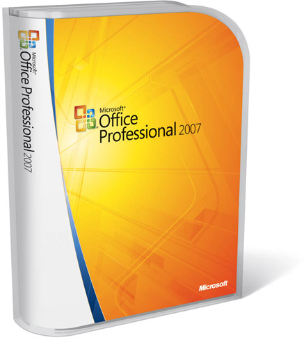
Let’s finish up this blog post on a lighter note. Back in the days, when buying software on CD’s was still a thing (not that long time ago!), Microsoft went from shipping their Office Suite CD’s in cardboard boxes to some fancy looking plastic boxes. Only problem was, that the retailers of these boxes would get calls from customers asking them how to open the boxes. Instead of opening the box like a normal CD case (which again draws direct inspiration from how you would open a book) buyers had to pull a thin, red plastic tap at the top of the box to slide the CD out of the box. It’s hard to explain this in text, so here is a video of the whole ordeal.

Microsoft software box
So what went wrong here? People get accustomed to how things work in the world and have certain expectations and mental models of how things work. When you design new things it’s therefore a good idea to draw inspiration from designs of existing things that people are already used to, have an existing mental of, and therefore do not have to think hard about how to use – just like how the design of CD cases drew inspiration from books, so people knew how to open them. In an attempt to stand out with fancy boxes for their software, Microsoft certainly did, but for the wrong frustrating reasons.
I’m sure you have some funny yet frustrating examples of bad usability design from your everyday life. Do feel free to share them in the comments!

